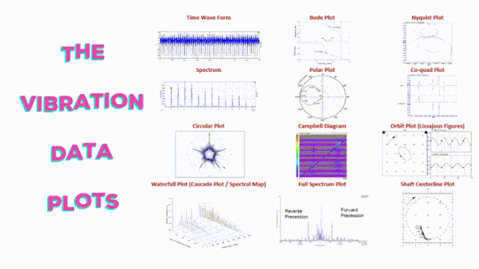
Time Wave Form (TWF)
It is the “Raw Signal” represents the machine forces being generated, As TWF represents data collected from a measuring point for different sources of vibration together, the result is a very complex waveform
Structure: a plot of Amplitude VS Time
Used to: Diagnose Beating, Amplitude Modulation, Bearing Faults, Gears Faults, Impacting, Rotating Looseness, Cavitation
Spectrum
It is derived from the TWF through a process called the Fast Fourier Transform (FFT) which allow to separate components that overlap in TWF and display them by frequency
Structure: a plot of amplitude VS frequency
Used to: Diagnose many faults as frequency tells the source of vibration and the amplitude tells the severity of vibration
Circular Plots
The circle plot wraps the TWF around in a circle, As It gives you an idea of how the vibration is changing relative to the rotation of the shaft
Used to: Diagnose synchronous faults such as gear teeth, rubs, vane/impellor faults, looseness
Waterfall Plot (Cascade Plot / Spectral Map)
It shows a lot of spectrum changes over time
Structure: a plot of Amplitude VS Frequency over a long time
Used to: Showing how the peaks & patterns have changed over a period of time
Bode Plot
It represents the magnitude and phase change with frequency
Structure: Two plots, First plot Magnitude VS Frequency, Second plot Phase VS Frequency.
Used to test for and characterize the natural frequencies of a structure.
Polar Plot
Display the same information as Bode Plot, as It plots magnitude vs. phase with phase as a vector.
Orbit Plot
Provide an indication of the dynamic movement of the center of the shaft.
Graph is generated by plotting the “Y” A.C. displacement signal against the “X” A.C. signal, and the position of the shaft reference (e.g. the keyway) is represented by a glowing dot.
Used to: Diagnose journal or fluid film bearings faults using non-contact eddy current or proximity probes.
Shaft Centerline Plot
Represent the movement of the center of the shaft / shows the limits of movement of the center of the shaft.
Used to: determine where, in relation to the limits of the bearing, the shaft is located, from the D.C. gap readings.
Full Spectrum Plot
It is the spectrum of an orbit. It is derived from the waveforms from two, orthogonal, shaft relative transducers, combined with knowledge of the direction of rotation.
Used to: Diagnose Unbalance, Unidirectional Radial Load, Rotor Crack, Partial Rub, Full Annular Rub, Fluid-induced whirl, Fluid-induced whip, Rotating stall.
Nyquist Plot
It graphs the real VS imaginary data with changing frequency.
The co-quad plot
Displays data in real & imaginary format. Among other things, we can get an accurate estimate of the natural frequency from these plots – the zero-crossing in the real data and the peaks in the imaginary data.
Campbell Diagram
In this plot the natural frequencies may be represented as circles and or the amplitude of vibration can be indicated by color or color intensity.